
1. Use a misleading y-axis range
The first time I noticed this in the wild was on food packaging. Below is an example of how you might see weight loss results presented:

Impressive. The product was something like 5x as effective as the competitor right?
Impressive. The product was something like 5x as effective as the competitor right?
Double-check the y-axis. Why would this start at 6.3 lbs? They're comparing weight loss, so the relevant baseline is 0 and that's where the y-axis should begin. Here's the non-misleading version:

Much easier to see the actual situation. Question any sources that present data in this way to mislead you.
2. Present only a subset of the data when there's no reason to exclude the whole set
Let's look at average daily high temperatures in Austin, Texas:

Wow...at that rate, temperatures are going to be insanely high in September since they appear to just rise steadily forever. At ~6 degrees (F) per month, that would be daily highs of 110 on average.
Wow...at that rate, temperatures are going to be insanely high in September since they appear to just rise steadily forever. At ~6 degrees (F) per month, that would be daily highs of 110 on average.
This is an obviously absurd example, but I've seen some that are nearly as crazy as presenting the first 6 months of the year as the data set to create the wrong trend.
Note the 'no reason to exclude the whole set' caveat. Imagine we had data from 1 billion years ago at Austin's latitude and longitude. That would not be at all relevant to recent, daily high temperatures, so you can ignore it and choose something reasonable for this dataset (e.g., years1970 - 2000).
Note the 'no reason to exclude the whole set' caveat. Imagine we had data from 1 billion years ago at Austin's latitude and longitude. That would not be at all relevant to recent, daily high temperatures, so you can ignore it and choose something reasonable for this dataset (e.g., years1970 - 2000).
3. Fit the data with the wrong fit
Consider the following data set and its fit:

That is clearly not a good fit. Why would you just stick a line on there and go? Consider a parabolic fit for example:

Much better. However, this still isn't ideal. You'd want to fit based on the underlying model, but that warrants its own topic so I won't go into details here. When you see a plot with a fit that clearly isn't applicable though, question if the creator is trying to mislead you.
Much better. However, this still isn't ideal. You'd want to fit based on the underlying model, but that warrants its own topic so I won't go into details here. When you see a plot with a fit that clearly isn't applicable though, question if the creator is trying to mislead you.
4. Use a pie chart when the values don't add to 100%
Imagine you ask if they are ok with two candidates and get the following results:
- 90% of people are ok with candidate A
- 85% of people are ok with candidate B
Here's a pie chart showing that:

Clearly less than half of all people are ok with candidate B right? No...the problem here is that the question allowed people to pick multiple options so the percentages don't add up to 100. Pie charts are rarely useful, and for this type of data they are outright misleading.
Clearly less than half of all people are ok with candidate B right? No...the problem here is that the question allowed people to pick multiple options so the percentages don't add up to 100. Pie charts are rarely useful, and for this type of data they are outright misleading.
5. Use a misleading data set
Imagine you want to answer the following question:
Which country's citizens are most responsible for CO2 emissions?
Which country's citizens are most responsible for CO2 emissions?
A plot you might see would then compare total CO2 emissions by country. Maybe you see in it that China produces 30% of all CO2 emissions and Saudi Arabia produces 2% of them. China's citizens are most responsible right?
When phrased that way, it's very misleading to use total emissions. You should use 'per capita' emissions which is total emissions divided by total population. In that case, Saudi Arabia produces over twice as much CO2 per person as China does.
This example is subtle but this is a common mistake made when presenting data. I'm from Selma, Alabama. Crime is extremely high there. However, only ~20,000 people live there. I could say 'Selma only has 280 violent crimes per year while Austin has 4,000 violent crimes per year so Selma is obviously safer' and that would be an example of this issue...Selma is tiny, so I'd need to compare crimes per 1,000 people instead of total crimes for that sort of statement.
6. Leave out the source data
In general, you should expect plots to be reproducible. There should be some mechanism for others to recreate it and do similar analysis with the data set. Leaving that out is a bad sign.
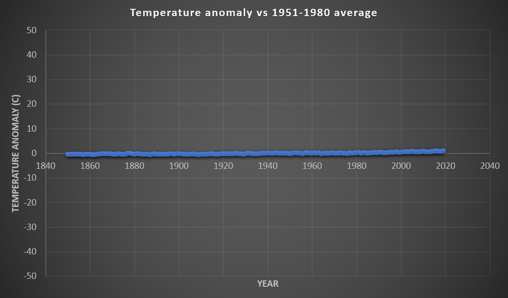
Trying these out on a real data set
The data below is temperature anomaly relative to 1951-1980 (annual values plotted with their uncertainties):
How can we use some of the tricks above to make this misleading?
How can we use some of the tricks above to make this misleading?
Let's try the first one. Here's that data set with the y-axis set to span from -50 degrees to 50 degrees:
No real trend anymore right? Normal temperatures on Earth are in that range, so it's clear that the temperature anomaly is so small that it doesn't matter based on our plot. This is garbage though...this is a mixture of #1 and a bit of #5's logic. a temperature shift of 2 degrees is catastrophic. Comparing temperature shift to total range of temperatures is incorrect.
No real trend anymore right? Normal temperatures on Earth are in that range, so it's clear that the temperature anomaly is so small that it doesn't matter based on our plot. This is garbage though...this is a mixture of #1 and a bit of #5's logic. a temperature shift of 2 degrees is catastrophic. Comparing temperature shift to total range of temperatures is incorrect.
Let's try the second one. Here's the 1998 to 2008 data from that data set:

That line is flat. It was actually higher in 1998 than 2008. Clearly the Earth is not warming right? No...this is a classic example of #2 with a bit of #1 (why would the scale set zero at 1998's value?).
That line is flat. It was actually higher in 1998 than 2008. Clearly the Earth is not warming right? No...this is a classic example of #2 with a bit of #1 (why would the scale set zero at 1998's value?).
It's good to keep an eye out for these. Data visualizations should seek to make the entire, relevant dataset easier to understand, but many low-quality publications intentionally use them to mislead, and sometimes we do this sort of thing by accident.
As a note, there are obvious issues with my reference plot also. 1951-1980 is a bad reference period IMO since you're generally looking at temperature anomalies related to human industrial activity, and that started way before then, so the baseline period is one that had already significantly warmed. For my reference plot, I should be clearer in that it's 'global' temperature anomaly.


I am impressed by the information that you have on this blog. It shows how well you understand this subject.
ReplyDeletedata science course
Great Article it its really informative and innovative keep us posted with new updates. its was really valuable. thanks a lot.
ReplyDeletefull stack development course
Thanks for sharing this.,
ReplyDeleteLeanpitch provides online training in Agile coach certification, everyone can use it wisely.
agile coach certification
icp acc certification